Creating a single source of truth for the Bricks Design System
View LiveOverview
The Bricks Design System (“Bricks”) supports the development of Conductor Intelligence, a B2B platform that helps enterprise organizations optimize their online presence.
Bricks’ documentation was nearly non-existent, so designers repeatedly rehashed the same design decisions in Slack rather than referencing any written record, while developers built components in Storybook whose capabilities outpaced what Figma showed, creating confusion at designer-developer handoff. I led the effort to diagnose the problem, interviewing six designers and engineers to surface their biggest pain points and shape the design and development of a single source of truth.
I built a new documentation site from the ground up using Supernova, leveraging variable syncing so component foundations stayed automatically up to date without manual maintenance. The site featured scannable dos and don’ts, interactive Storybook embeds that showed real component behavior instead of describing it, and side-by-side comparisons for the components designers decided between most often. I launched V1 to 50+ members of R&D in September 2024 and shipped two rounds of iteration based on their feedback, ultimately documenting all 26 foundational components across 120+ pages and decreasing design system questions posted to Slack. Nearly two years later, the documentation is still actively used by the team.
Problem
Incomplete design system documentation leads to workflow bottlenecks and designer-developer miscommunication.
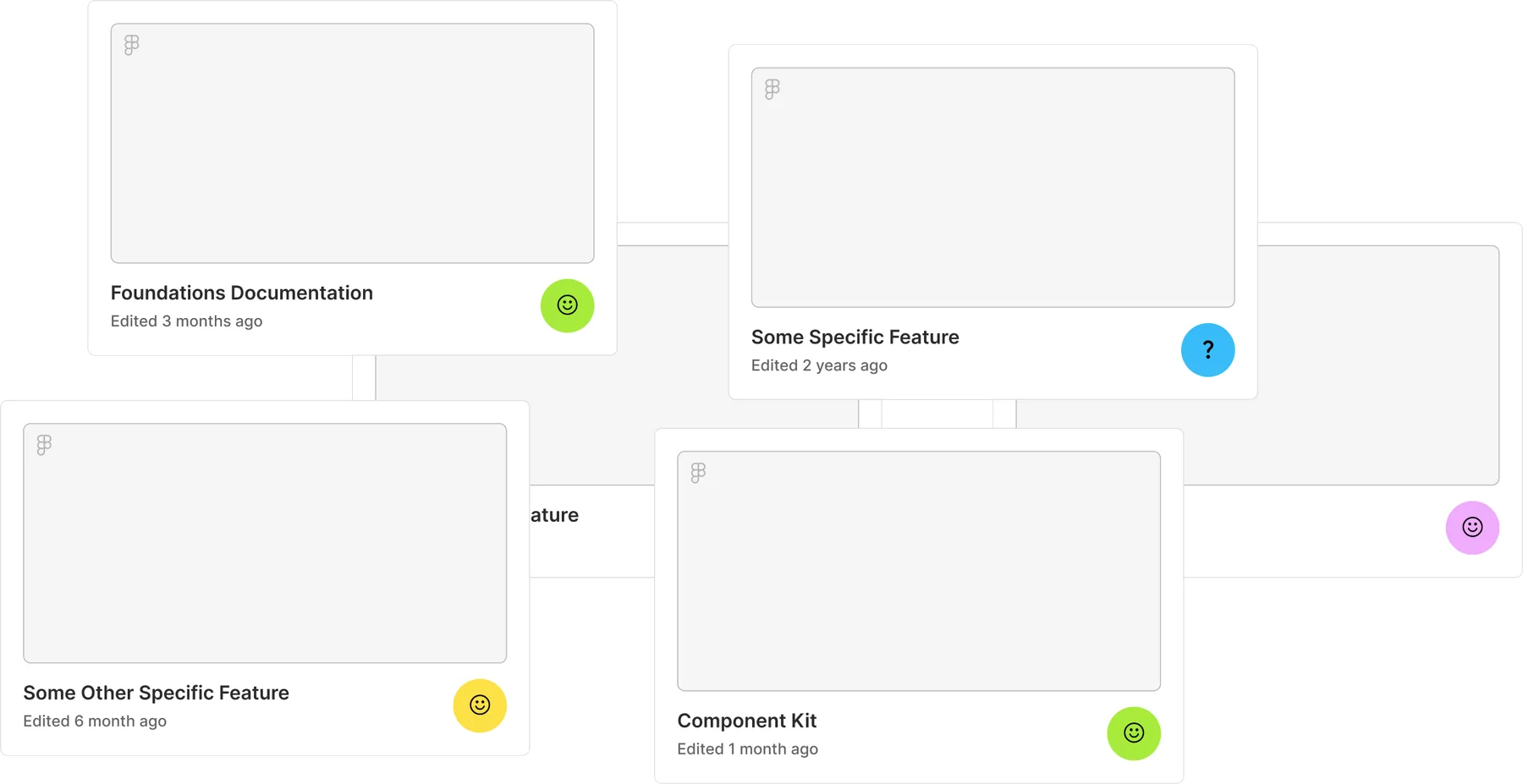
Designers' Pain Points
Incomplete documentation = workflow bottlenecks and decision re-hash
To best understand the current processes surrounding the Bricks Design System, I interviewed 3 designers and 3 engineers. It became clear that,
Designers do not trust the existing design system documentation because it is incomplete and outdated.
This leads designers to answer their design system related questions in one of three ways:
Ask the design systems lead, creating a workflow bottleneck.
Search past design files to mimic previous applications of certain components.
Post their question to Slack where the design team collectively rehashes design decisions that were already made (but never written down) a couple features back.
Developers' Pain Points
Storybook components don't match Figma representations
The capabilities of the built Bricks components in Storybook were much broader than the more constrained Figma representations, creating confusion at designer-developer handoff.
Solution
A trusted, single-source of truth that aligns development and design teams.
View Live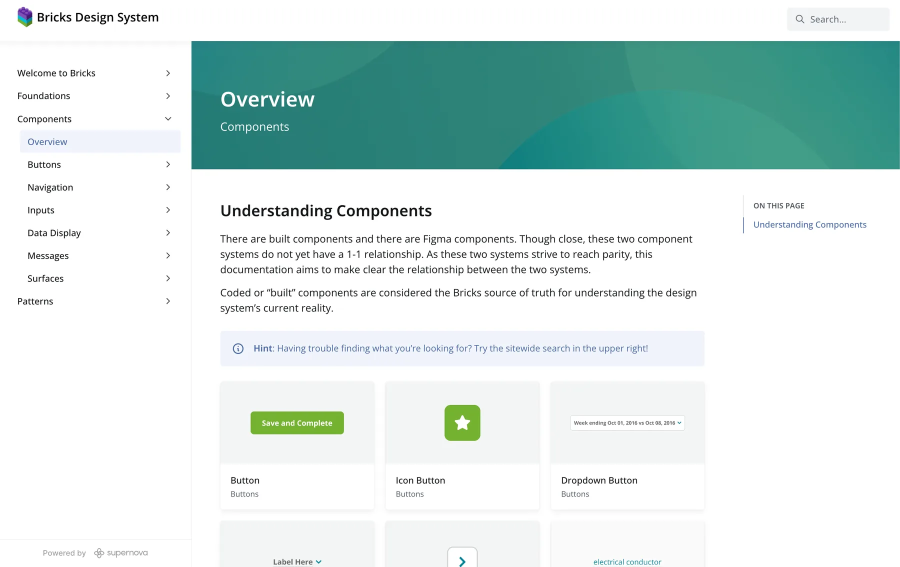
Show, don't tell
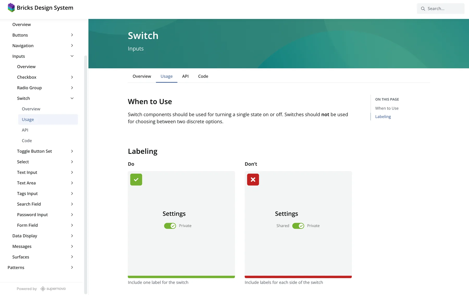
Scannable dos & don'ts
Top design system documentation sites like IBM Carbon list dos and don'ts for their components in a quickly scannable and digestible way. I developed similar dos and don'ts sections to help designers quickly find and review component usage guidelines.
Interactive Storybook embeds communicate expected behavior
Instead of describing expected component behavior, I relied on interactive Storybook embeds. This provides designers with a richer, visual-first understanding of expected component behavior. This also helps designers better understand the built components, improving cross-collaboration between design and development teams.
Surface component use cases early for discoverability
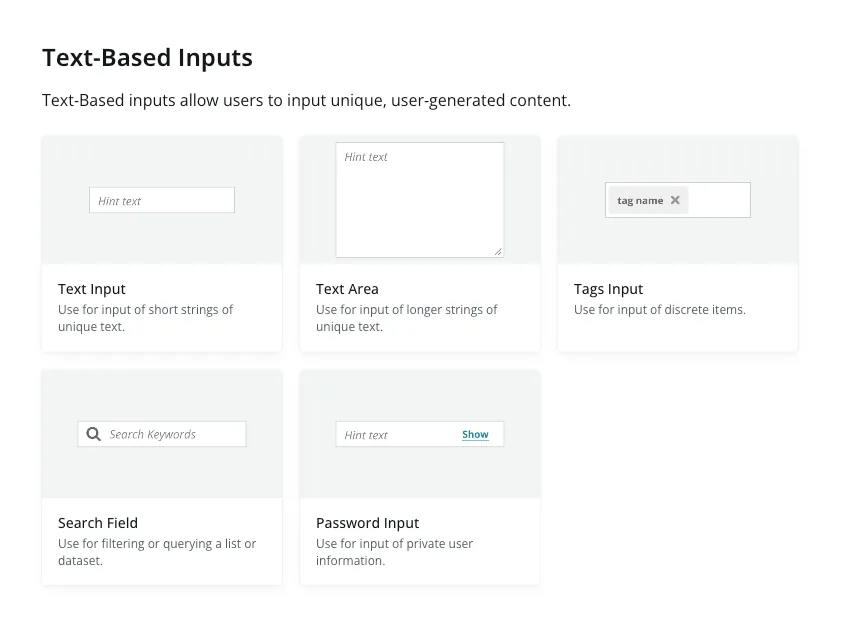
After feedback on V1 from the design team, I iterated to create landing pages for each grouping of components that surfaces their targeted use cases for better discoverability and quick decision-making.
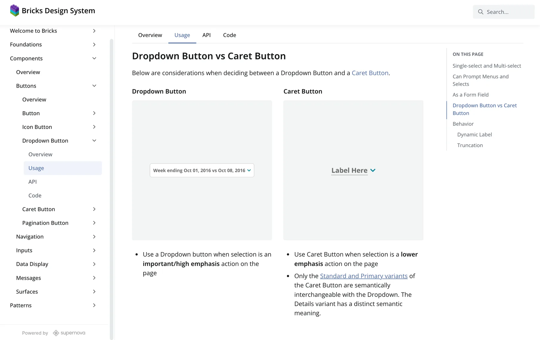
Side-by-side comparisons differentiate similar components.
Most design systems questions sent to the Slack channel followed the form “Should I use X component or Y component in this situation?” To meet the unique needs of Conductor's specific design team, I included documentation sections that explained the differences between the most frequently confused components.
Behind the Scenes
Repeatable and maintainable process supporting long-term quality and scale.
When new components do need to be added to the documentation site, I built slot-component Figma templates to quickly and easily update the documentation and maintain visual consistency.
Impact
No more bottlenecks
100%
All 26 foundational components documented
Fewer design system use-case questions posted to Slack
Takeaways
Done is better than perfect
Striving for flawless results can lead to overthinking, procrastination, and unnecessary delays. When something is finished, even if it's not perfect, it allows room for growth and improvement. That was the entire goal of this project — to establish a foundation for designers and developers to contribute to and own together moving forward.